Browser agent UX guide for forms and modals
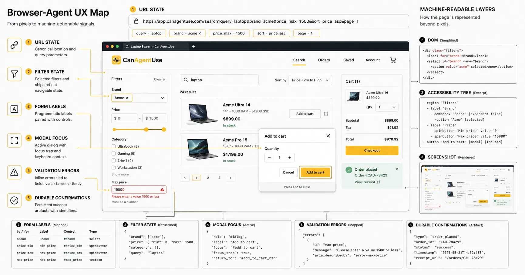
Browser agent UX guide with 6 signals, 14.41% WebArena baseline, form labels, filter state, modal focus, and durable confirmations.
Share
Browser agent UX is the design and engineering work that lets software operate a website through the browser without guessing what the page means.
That sounds like a niche concern until you watch an agent try to do a normal task: select a product size, filter a catalog, complete a quote form, choose a delivery date, dismiss a cookie dialog, upload a document, or confirm that a payment step has not yet happened.
The page may look clean to a person. The agent sees a messier surface: DOM nodes, accessible names, roles, values, screenshots, focus position, URLs, network timing, and whatever state survived after the last click.
W3C's Accessible Name and Description Computation spec says browsers create an accessibility tree from the DOM and expose each object with role, state, properties, name, and description (W3C AccName 1.2, 2026-06-29). Browser agents are not screen readers, but many of their most reliable signals come from the same machinery.
TL;DR Browser-agent UX depends on inspectable meaning: accessible names, semantic roles, current values, selected state, error messages, focus behavior, URL state, and durable confirmation. Forms, filters, and modals are the sharpest test cases because they change task state. If those components only communicate through visual styling, animation, or short-lived toasts, agents misread the workflow and repeat actions.
Browser-agent UX is not the same as making a page "AI themed." It is ordinary web quality made explicit enough for software. Inspectable state means the selected filter, focused dialog, field error, current step, saved value, or cart result can be read after an action. Durable confirmation means success or failure remains visible long enough for the agent to verify it.
The research backdrop matters. WebArena found that a GPT-4-based baseline completed only 14.41% of realistic web tasks end to end, while human performance was 78.24% (WebArena, 2023). Mind2Web collected more than 2,000 tasks across 137 real websites and 31 domains, then noted that raw real-world HTML is often too large and noisy for agent models to consume directly (Mind2Web, 2023). The issue is not just model quality. The web surface itself is hard to read.
We tested these patterns against agent-facing page captures, accessibility snapshots, and normal keyboard paths. From our testing, the same failures kept repeating: unlabeled controls, hidden selected state, modal focus leaks, short-lived success messages, and buttons whose names did not match their consequences. In our experience, a visual QA pass misses those problems because the page looks finished.
This article is an engineering map for that surface. It is written for product engineers, design-system owners, growth teams, accessibility leads, QA teams, and anyone whose signup, checkout, support, search, or account flows may soon be operated by people and agents together.
Reviewed under the CanAgentUse editorial process; see our about and contact pages for context.
What does browser agent UX need to expose?
A browser agent perceives a page through multiple lossy channels, not through a perfect mental model of your design system. Most stacks combine rendered HTML, browser-exposed accessibility structure, visible text, screenshots, layout boxes, network events, and action history. If those channels disagree, the agent has to choose which one to trust.
In practice, the agent builds a working model like this:
| Perception channel | What it contributes | Where it breaks |
|---|---|---|
| DOM | Elements, attributes, text, form values, custom data | Too large, nested, framework-generated, or semantically thin |
| Accessibility tree | Role, name, value, state, description | Missing labels, wrong ARIA, hidden text, focus leaks |
| Screenshot | Visual layout, relative position, icons, color cues | Cannot prove state, hard to parse small text, ambiguous controls |
| URL | Route, query, filters, step, shareable state | Single-page apps may hide state in memory |
| Network | Requests, responses, status, API errors | Often unavailable to external agents, not enough user context |
| Action history | What was clicked or typed | Does not prove whether the action worked |
| Page text | Instructions, errors, confirmations, policies | May be stale, duplicated, hidden, or decorative |
Playwright's locator guidance is a useful proxy for agent-readable UI because it favors the same signals. It recommends locating controls by role and accessible name, such as a checkbox named "Subscribe" or a button named "Submit" (Playwright locators, 2026-06-29). If your automated tests cannot find a control by role and name, a browser agent will probably have a harder time too.
Browser-agent UX starts with the browser's exposed structure. W3C AccName describes how user agents derive accessible names, descriptions, roles, states, and properties from web content, and Playwright's role locators use similar user-facing semantics. If a page cannot expose "button, Save shipping address" instead of an anonymous clickable div, agent reliability drops before the model even starts reasoning.
The important word is "working." Agents do not need a perfect semantic ontology of your page. They need enough reliable evidence to decide the next step and verify the result.
Why do visually clear pages still fail?
Visually clear pages fail when the meaning lives in pixels instead of state. A designer can make a disabled button look disabled. A person sees the gray treatment and stops. An agent needs a disabled property, a reason, or a readable prerequisite. Without that, it may click anyway, decide the site is broken, or loop through the same step.
The failure pattern repeats across components:
| Human inference | Agent-readable equivalent |
|---|---|
| "This chip is blue, so it is selected." | aria-pressed, checkbox state, selected option, or active filter text |
| "The field border is red." | Error text linked to the field |
| "The spinner is still moving." | Loading state and a settled completion state |
| "The modal darkened the page." | Dialog role, focus containment, inert background |
| "That button is final." | Specific action name, amount, and confirmation boundary |
| "The results changed." | Result count, active filters, URL parameters, or result heading |
| "The toast said saved." | Persistent saved value or confirmation region |
One small example: a product card has two icon buttons. One is "save," one is "compare." They have SVG icons and hover tooltips. They look obvious to a person who knows the brand iconography. In the accessibility tree, both are just "button." A browser agent can see two buttons, but it cannot safely choose.
This is why "agent UX" sounds new but mostly punishes old shortcuts. Missing labels, fake buttons, custom selects, click-only widgets, disappearing feedback, and ambiguous text have always made the web worse. Agents make the cost more visible.
What are the six signals every task needs?
Every browser task needs six signals: name, role, value, state, error, and confirmation. If a component cannot provide these, the agent either guesses or asks for help.
| Signal | Question it answers | Example |
|---|---|---|
| Name | What is this control for? | "Email address," "Apply price filter," "Close delivery dialog" |
| Role | What kind of thing is it? | button, link, textbox, checkbox, tab, dialog, table |
| Value | What does it currently contain? | selected size, entered email, chosen date |
| State | What condition is it in? | checked, expanded, disabled, invalid, loading, current step |
| Error | What went wrong, and where? | "ZIP code must be 5 digits" linked to ZIP field |
| Confirmation | Did the action finish? | "Address saved," active filter chip, cart line item |
The W3C forms tutorial organizes accessible forms around labels, grouping, instructions, validation, notifications, multi-page forms, and custom controls (W3C WAI forms tutorial, updated 2026). That list is almost exactly what a browser agent needs. Labels identify targets. Instructions reduce ambiguity. Validation creates recoverable errors. Notifications tell the agent whether the task worked.
This is the core contract:
<label for="shipping-postal-code">ZIP code</label>
<input
  id="shipping-postal-code"
  name="postalCode"
  autocomplete="postal-code"
  aria-describedby="shipping-postal-code-help shipping-postal-code-error"
  aria-invalid="true"
/>
<p id="shipping-postal-code-help">Use the ZIP code for the delivery address.</p>
<p id="shipping-postal-code-error">ZIP code must be 5 digits.</p>
It is not glamorous. It is readable. A person understands it, a screen reader understands it, a QA test understands it, and an agent has a chance.

Why are forms the first serious browser-agent test?
Forms force an agent to interpret intent, transform it into fields, handle validation, and prove completion. They are where vague UI becomes expensive.
Take a simple demo request:
"Ask sales for a quote for 25 seats, mention that we need SSO, and use my work email."
That can fail in at least twelve ordinary ways:
| Failure | Why it happens | Better design |
|---|---|---|
| Agent enters the message in the wrong field | Field labels are placeholders | Persistent labels tied to inputs |
| Agent skips required company size | Required state appears only after submit | Required fields marked before submit |
| Agent cannot choose "25 seats" | Custom select has no value state | Native select or ARIA combobox with value |
| Agent submits too early | Button says "Continue" on every step | Action-specific button text |
| Agent misses validation | Error is color-only | Field-level error text and aria-invalid |
| Agent repeats submit | Confirmation is a short toast | Persistent success message or thank-you route |
| Agent cannot recover | Form clears on error | Preserve entered values |
| Agent cannot tell step progress | Multi-step form hides current step | Step heading and progress text |
| Agent picks wrong country | Autocomplete selects first suggestion silently | Confirmed selected value visible |
| Agent uploads wrong file | File input only shows icon | File name and remove action visible |
| Agent accepts marketing opt-in | Checkbox label is vague | Specific consent label |
| Agent crosses legal boundary | Final action text is generic | "Submit quote request" or "Authorize payment" |
The W3C tutorial explicitly calls out validation and user notifications, including errors and successful completion messages (W3C WAI forms tutorial, 2026-06-29). That matters because a browser agent cannot rely on a user's memory of what just flashed on screen.
Forms are hard for browser agents because they combine label resolution, value entry, validation, consent, and completion proof. W3C's form guidance covers labels, instructions, validation, notifications, and multi-page progress. Those same signals let agents recover from field errors instead of resubmitting or abandoning a flow.
The hidden trap is not "bad HTML" in the abstract. It is mismatched responsibility. Design thinks the form is obvious. Frontend thinks validation is handled. QA tests the happy path. Growth wants fewer labels to reduce visual clutter. The agent becomes the first actor that notices the whole contract is underspecified.
How should teams design field labels and instructions?
Labels are not decoration. They are object identity. A browser agent can often click or type into an input only after it resolves the label, role, and current value.
Use labels like an engineer uses stable identifiers:
| Field | Weak label | Better label |
|---|---|---|
| Work email | "Email" if personal email is rejected later | "Work email" |
| Company size | "Size" | "Number of employees" or "Number of seats" |
| Postal code | "Code" | "ZIP code" or "Postal code" |
| Product option | "Type" | "License type" or "Plan type" |
| Date | "When?" | "Preferred delivery date" |
| Consent | "I agree" | "I agree to the Terms of Service" |
Use help text when the user intent could map to multiple fields. "Seats" and "employees" are not interchangeable. "Delivery date" and "event date" are not interchangeable. "Phone" may mean billing phone, shipping phone, or account recovery phone.
The accessible name algorithm matters here because it defines what the browser exposes as the control's name. The AccName spec describes names as flat strings derived from author-provided markup, visible content, or host-language labeling features (W3C AccName 1.2, 2026-06-29). If your visible label and aria-label disagree, you have created two realities.
Bad:
<button aria-label="Submit">Pay $248.31 now</button>Better:
<button>Pay $248.31 now</button>The better version exposes the actual commitment. It also makes tests less brittle and gives a human using assistive technology the same boundary a sighted user sees.
What makes custom selects and comboboxes dangerous?
Custom selects are where design systems quietly break agent operation. A native <select> carries role, value, options, disabled state, keyboard behavior, and form submission semantics. A custom combobox has to rebuild those affordances correctly.
WAI-ARIA's combobox pattern defines an input with an associated popup, optional autocomplete behavior, keyboard interaction, expanded and collapsed states, and a distinct accessible name and value (WAI-ARIA APG combobox pattern, 2026-06-29). That is a lot of contract to recreate for a prettier dropdown.
Agent failure cases:
| Custom control behavior | Agent risk |
|---|---|
| Popup opens only on mouse hover | Keyboard and scripted operation fail |
| Selected value is visual text outside the control | Agent cannot read current value |
| Options are rendered in a portal without relationship | Agent cannot connect popup to input |
| First suggestion auto-selects on blur | Agent may commit a value it did not choose |
| Escape closes and clears value unexpectedly | Recovery changes state |
| Placeholder remains after selection | Agent thinks field is empty |
| Hidden input has stale value | Submitted data differs from visible choice |
For high-risk fields, choose boring controls unless there is a real product need. Country, state, plan, size, payment method, delivery date, and identity fields do not need expressive UI as much as they need predictable semantics.
If you must use a custom combobox, test it like a protocol:
- Can an agent find it by role and name?
- Can it read the current value when collapsed?
- Can it open the option list with keyboard input?
- Can it identify the focused option?
- Can it select an option and verify the final value?
- Can it escape without changing value?
- Can it handle invalid free text?
- Does the submitted value match the visible value?
That last check catches a surprising number of bugs.
Why do filters and faceted search break agent reasoning?
Filters change the information universe. A person can see that the page now shows "black, size M, under $100, sorted by price." A browser agent needs those constraints as inspectable state.
A faceted search page should expose five state layers:
| Layer | Agent-readable requirement |
|---|---|
| Query | Current search term, category, or collection |
| Constraints | Active filters, ranges, toggles, availability, location |
| Sort | Current sort order and direction |
| Results | Count, empty state, page number, visible result identities |
| Recovery | Clear individual filters, reset all, broaden query |

The URL should carry as much non-sensitive filter state as practical. URL state helps agents, users, QA, support, analytics, and indexation. It also creates a shareable bug report. "The user saw no products" is vague. /bags?color=black&size=carry-on&sort=price_asc&max=180 is debuggable.
That does not mean every filter URL should be indexable. Search engines and AI fetchers are a separate policy question. But browser-agent operation benefits when the state has a durable representation.
A simple pattern works better:
<h1>Carry-on luggage</h1>
<p id="result-summary">18 results for carry-on luggage, filtered by color: black and max price: $180.</p>

<section aria-labelledby="active-filters-heading">
  <h2 id="active-filters-heading">Active filters</h2>
  <button aria-label="Remove color filter: black">Black</button>
  <button aria-label="Remove max price filter: $180">Under $180</button>
  <a href="/luggage/carry-on">Clear all filters</a>
</section>
This lets an agent answer three questions after any refinement: what is selected, how many results remain, and how to recover.
Faceted search needs durable filter state because every refinement changes the task context. Agents need the query, active filters, sort order, result count, empty-state reason, and clear controls. URL parameters help, but the rendered page should also expose selected filters and counts so the agent can verify what changed.
The deeper product issue is that filters are often designed as micro-interactions. They should be designed as state transitions.
How should product cards and result lists be structured?
Result lists are task surfaces, not decorative grids. Agents need to bind an action to the right item. "Click Add to cart" is unsafe if there are twenty identical "Add to cart" buttons with weak product identity.
Playwright's locator examples show a common testing pattern: find a list item by text, then find the "Add to cart" button inside that item (Playwright locators, 2026-06-29). That is a good mental model for browser-agent UX too. The product card should be a bounded object with a name, attributes, price, availability, and local actions.
Agent-ready result cards expose:
| Card signal | Example |
|---|---|
| Item name | "AeroLite 21 inch carry-on" |
| Stable link | Canonical product URL |
| Price | "$149.00" |
| Variant summary | "Black, 21 inch" |
| Availability | "In stock" or "Backorder until July 8" |
| Policy signal | "Free returns for 30 days" |
| Local action | "Add AeroLite 21 inch carry-on to cart" |
| Compare/save action | "Save AeroLite 21 inch carry-on" |
Bad:
<button>Add to cart</button>Better:
<article aria-labelledby="product-aerolite-title">
  <h2 id="product-aerolite-title">
    <a href="/products/aerolite-21-black">AeroLite 21 inch carry-on</a>
  </h2>
  <p>$149.00. Black. In stock. Free returns for 30 days.</p>
  <button>Add AeroLite 21 inch carry-on to cart</button>
</article>
The button name is longer, but the task is safer. You can keep the visible text short and use accessible naming carefully, but do not hide meaning from the agent. The safest pattern is usually visible text that already says enough.
Why are modals a task boundary?
A modal is not just a visual layer. It changes which part of the page is active. For a browser agent, a modal creates a new task boundary with its own title, focus rules, controls, errors, and completion signal.
The WAI-ARIA dialog pattern says content underneath a modal dialog is inert, focus should move inside the dialog, Tab and Shift+Tab should stay inside it, Escape should close it, and the dialog should have a visible title or accessible label (WAI-ARIA APG dialog pattern, 2026-06-29). Those rules also prevent the agent from clicking the page behind the active task.

Modal failure cases:
| Modal behavior | Agent risk |
|---|---|
| Focus stays on background page | Agent interacts with hidden or inert content |
| Dialog has no title | Agent cannot identify the task |
| Close icon has no name | Agent cannot cancel safely |
| Primary action says "Continue" | Agent cannot tell what commitment it makes |
| Errors render behind modal | Agent misses validation feedback |
| Modal closes on success with no page update | Agent cannot prove the action worked |
| Background content remains clickable | Agent may change state outside the dialog |
| Dialog opens inside another untracked layer | Agent loses task context |
Cookie consent, newsletter capture, plan selection, address editing, date pickers, account reauthentication, and payment challenges all use modals. Payment and consent modals deserve the strictest language. Do not let a final action hide behind "Continue."
Use:
- "Save delivery address"
- "Apply discount code"
- "Use card ending 4242"
- "Place order for $162.74"
- "Cancel subscription renewal"
Avoid:
- "Continue"
- "Next"
- "Done"
- "OK"
- "Confirm" without an object
Modals are task boundaries for browser agents. WAI-ARIA's dialog guidance requires inert background content, focus containment, keyboard escape behavior, and a dialog name. Those same rules help agents avoid background clicks, identify the modal purpose, recover from errors, and distinguish a harmless continuation from a payment or cancellation boundary.
The naming may feel verbose. That is fine. Verbose is cheaper than accidental commitment.
What does durable confirmation look like?
Durable confirmation is the part of the interface that remains after the moment of feedback. It answers: did the action happen, and what state exists now?
Transient feedback has a place. Users like quick toasts. Agents need evidence after the toast is gone.
| Action | Weak confirmation | Durable confirmation |
|---|---|---|
| Save address | Toast: "Saved" | Address card shows updated address and "Default shipping address" |
| Apply filter | Grid changes | Active filter chip, result count, URL update |
| Add to cart | Cart icon bounces | Cart line item with product, variant, quantity, subtotal |
| Submit form | Modal closes | Thank-you page or persistent confirmation region |
| Select plan | Button color changes | Plan summary shows selected plan and price |
| Upload file | Spinner stops | File name, size, status, remove action |
| Start trial | Button disappears | Account status shows trial start and end date |
Durable confirmation reduces duplicate actions. If an agent can prove a thing happened, it has less reason to click again during recovery. Humans benefit too. A page that clearly shows "Saved shipping address" is less stressful than a page that briefly whispered it.
For higher-risk actions, confirmation should include the object, the new state, and a recovery path:
<section role="status" aria-labelledby="cart-confirmation-heading">
  <h2 id="cart-confirmation-heading">Added to cart</h2>
  <p>AeroLite 21 inch carry-on, black, quantity 1, was added to your cart.</p>
  <a href="/cart">View cart</a>
  <button>Remove AeroLite 21 inch carry-on from cart</button>
</section>
That is confirmation as state, not confetti.
How do protocols change the browser surface?
MCP, OpenAPI, A2A, UCP, and Agent Cards can expose cleaner machine interfaces. They do not retire the browser. They add another route.
The browser remains the fallback for:
| Scenario | Why browser-agent UX still matters |
|---|---|
| No API exists | Agent must operate the UI |
| API does not cover the task | Agent switches to browser |
| API auth is not configured | User may already be signed in through browser |
| Policy needs human review | Agent needs visible terms and confirmations |
| Checkout or payment is sensitive | Browser may host consent and wallet UI |
| Support flow is fragmented | Agent must use help center, chat, and account pages |
Protocol readiness and browser readiness should agree. If your MCP tool says an item is returnable but the product page says final sale, the agent has a conflict. If your UCP checkout object has one total and the browser cart shows another, the agent must stop or ask the user.
Treat the browser as the public truth surface. Treat protocols as structured paths through the same truth.
What should a component contract include?
Design systems should document component semantics the same way they document color, spacing, and variants. A button component that cannot describe its loading, disabled, and commitment state is not complete.
Use a contract like this:
| Component | Required contract |
|---|---|
| Button | Role, accessible name, disabled state, loading state, action object |
| Link | Destination and purpose from link text |
| Text input | Label, value, required state, help text, field-level error |
| Checkbox/radio | Group label, checked state, individual label |
| Combobox | Name, value, expanded state, option list, selected option |
| Tabs | Selected tab, associated panel, keyboard behavior |
| Modal | Title, focus trap, inert background, close action, primary action |
| Toast/status | Role, text, duration, persistent log when needed |
| Table | Headers, row labels, sortable state, caption |
| Product card | Name, canonical URL, price, availability, local actions |
| Cart line item | Product, variant, quantity, unit price, total, remove/edit |
| Stepper | Current step, completed steps, next action, back action |
This table belongs in a design system, not in a one-off "AI readiness" document. Once semantics are part of the component contract, every product flow gets better by default.

How should teams test browser-agent UX?
Test the page as a layered system. A full autonomous run is useful, but it is too expensive as a first diagnostic. Start by asking whether the task is readable at all.
Layer 1: semantic inspection
Use browser devtools, accessibility tree inspection, Playwright locators, or an agent-facing page snapshot. Check whether the core task can be described as named controls and state.
Check whether important controls can be found by role and name, fields have persistent labels, custom controls expose values, the current step has a heading, errors are linked to fields, and success remains visible.
Layer 2: keyboard path
Use only the keyboard. This catches focus leaks, hover-only controls, modal traps, and custom widgets that look fine but are not operable.
Check whether the task can start without a mouse, focus moves into and out of dialogs, popups can be opened and closed, tab order is logical, and destructive or payment actions can be avoided.
Layer 3: negative paths
Agents fail in the same places users fail. Test invalid postal codes, expired sessions, missing required fields, empty result sets, unavailable variants, rejected coupons, and failed uploads.
Check whether the reason is readable, the failed field is identifiable, entered values remain intact, a next action exists, and retry cannot duplicate the original action.
Layer 4: state comparison
Compare the browser UI, URL, API response, analytics event, and backend record for the same task. They should tell the same story.
Example:
| Surface | Expected evidence |
|---|---|
| UI | "Black carry-on added to cart" |
| URL | /cart or cart drawer state |
| API | line item with product ID and variant |
| Analytics | add-to-cart event with same item |
| Backend | cart session with same line item |
If those surfaces disagree, the agent will eventually find the gap.
Browser-agent testing should begin with semantics, keyboard operation, negative paths, and state comparison before a full autonomous run. WebArena and Mind2Web show that real web tasks remain difficult for agents, so teams should reduce avoidable ambiguity in labels, focus behavior, validation, filter state, and confirmations first.
Layer 5: mobile width
Mobile layouts often change navigation, filters, modals, and action placement. Agents using browser control may operate mobile or narrow viewports, especially when sites block desktop automation or serve responsive layouts. Test the same task at mobile width with filters hidden behind drawers and sticky buttons.
What are the failure modes worth logging?
Browser-agent UX should produce logs that help engineering teams fix specific state failures, not just "agent failed."
Log:
| Log field | Example |
|---|---|
| Task type | quote form, product filter, checkout step, support request |
| Page URL | /pricing?plan=team |
| Agent-visible step | "Billing address" |
| Target control | role=button, name="Save billing address" |
| Action | click, fill, select, upload |
| Pre-action state | field values, active filters, modal open |
| Post-action state | success, error, no visible change |
| Error text | "ZIP code must be 5 digits" |
| Recovery offered | edit, retry, clear, contact support |
| Duplicate guard | idempotency key, disabled button, cart line item |
You do not need to log sensitive field values. You do need enough event structure to know whether the page failed to expose state, the agent chose the wrong target, or backend validation rejected the action.
What should teams fix first?
Fix the parts where state changes and mistakes have consequences.
Priority order:
- Signup, login, password reset, and account recovery.
- Lead forms, quote forms, demo booking, and contact flows.
- Search, filters, sort, pagination, and result cards.
- Cart, checkout, payment, coupon, and shipping steps.
- Modals that handle consent, plan choice, address, reauth, or payment.
- Support flows, returns, cancellation, and account settings.
For each flow, ask a plain question:
After each click or typed value, can software prove what happened?
If the answer is no, add state. Usually that means better labels, explicit selected values, visible errors, persistent confirmations, and less clever custom UI.
FAQ
What is browser-agent UX?
Browser-agent UX is the design and engineering layer that lets AI agents use a website through the browser. It depends on semantic HTML, accessible names, roles, values, selected state, focus behavior, errors, loading state, URLs, and durable confirmations that remain after an action.
Is browser-agent UX just accessibility?
No. Accessibility and browser-agent UX overlap heavily because both need labels, roles, focus, keyboard support, and state. Browser agents also need task-level verification, such as result counts, cart line items, active filters, saved values, and confirmation messages that persist long enough to inspect.
Why do forms fail for browser agents?
Forms fail when labels are placeholders, required fields appear only after submit, custom controls hide selected values, validation uses color only, or success appears as a short-lived toast. Agents need persistent labels, field-level errors, preserved values, specific submit actions, and durable completion evidence.
Why do modals need special treatment?
Modals create a task boundary. The agent needs to know that a dialog opened, which task it owns, where focus is, which controls are inside it, how to close it, and whether the modal action succeeded. Payment and cancellation modals need especially explicit action names.
Do protocols like MCP remove the need for browser-agent UX?
No. Protocols can expose structured actions, but agents will still use the browser for unsupported tasks, authenticated sessions, policy review, checkout, support, and long-tail workflows. Protocol surfaces and browser surfaces should expose the same facts so agents do not see conflicting state.
Conclusion
Browser-agent UX is not a separate design trend. It is what happens when your web interface becomes an interface for software too.
The fix is not to redesign the whole site around agents. Start smaller and more technical. Give controls real names. Use roles that match behavior. Preserve values. Expose selected state. Bind errors to fields. Treat modals as task boundaries. Keep confirmations around long enough to inspect.
That work improves accessibility, QA automation, conversion debugging, support handoff, and agent reliability at the same time. It is not flashy, but it is the part that makes the flashy demos survive contact with real websites.
Sources
- W3C: Accessible Name and Description Computation 1.2, 2026-06-29.
- W3C Web Accessibility Initiative: Forms tutorial, 2026-06-29.
- WAI-ARIA Authoring Practices Guide: Dialog modal pattern, 2026-06-29.
- WAI-ARIA Authoring Practices Guide: Combobox pattern, 2026-06-29.
- Playwright: Locators, 2026-06-29.
- Mind2Web: Towards a Generalist Agent for the Web, 2026-06-29.
- WebArena: A Realistic Web Environment for Building Autonomous Agents, 2026-06-29.
- WebChoreArena: Evaluating Web Browsing Agents on Realistic Tedious Web Tasks, 2026-06-29.
- CanAgentUse Agent Website Viewer launch, AI agent readiness guide, and agentic commerce readiness checklist.
Share